Industry news
Clean motifs, bold typography - the new look of SZABADICS Group

"The stylistic features of our new identity are basically defined by three concepts - drive, renewal, and old values - and our aim was to create a youthful, modern, clean design. A key priority was also to create an easily identifiable, elegant, simple corporate identity for outdoor and online, which would unify the look of all our subsidiaries and subbrands under the SZABADICS Group banner"
- summarized the group's image needs Szabadics Roland, the company's Chief Operating Officer, adding that "we expect the new, vibrant, trendy look to make our group more attractive to young people, and to convey quality to our customers, which is reflected not only in our work, but also in our appearance."

Representation of core values
The new SZABADICS Group logo was created by keeping the familiar SZABADICS logo, which of course represents the main brand, the SZABADICS Group, but of course each subsidiary has its own logo based on this logo. The logo includes the Est. 1989., which underlines the more than three decades of the group's history and reflects its long-term, sustainable operation and stability.
A new vibrant, youthful red, NEON RED, will be the company's logo this autumn, replacing the classic burgundy used previously to make the brand more recognisable. In addition to this main colour, the company will also be represented by a more muted navy blue (the lettering "group" and subbrands) and a medium grey (year, cellular mesh). A cellular structure resembling building blocks has been chosen as a visual element to symbolise the internal-external network of connections and community. This pattern can be animated and brought to life in 3D video with various effects.
"We also use the logo and the colours in an inverse form, when the bright red background is covered with white lettering, which gives it an even more striking, sexier look, which is probably the way I like it best" - added the chief operating officer.

Joint decision
They also involved their colleagues in the rebranding process, who were consulted on several fronts. Their slogan was put to a vote based on ideas from colleagues, with a cash prize for the winning idea. The interest is shown by the 130 suggestions received.
The logo was continuously reviewed with senior management during the refinement process, where the consensus was that the name SZABADICS represents brand, and that is what the world knows, so the logo was updated with a fresh colour scheme, the Group logo and new visual elements, keeping the previous font style.
"After finalising the logo and the colours, we started to place the design elements on our interfaces and to create the design manual, which was finalised in the last few days," said Roland Szabadics.
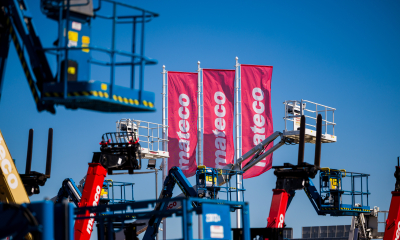
Naturally, our new image is present on all SZABADICS Group surfaces: vehicles, workwear, accessories, safety equipment, website design, social media, presentations, internal newsletter, outdoor (banners, flags), print and online publications, image ads, roll-ups and business cards show the world the renewal of the company.
"a small interesting fact is that from now on," the director explained, "we will give our colleagues QR code business cards, and we will provide everyone with a new vCard, an electronic business card designed with the new image, for their phone."

A great welcome
"We at SZABADICS Group are constantly changing, adapting to the market environment and internal needs," summarised Roland Szabadics. With our rebranding we want to show the world the momentum of the current generational change, our renewal - of course keeping our old values. Our new identity is a Group-wide vision that unifies the identity elements of our subsidiaries, while giving them the autonomy they need."
So far, they have received very positive feedback from their colleagues and partners, as confirmed by a recent satisfaction survey. As one of the company's colleagues wrote:
"Congratulations on the design elements that have been developed and adopted. It is high quality, modern, dynamic, up to date and has everything I think the Group needs to show what we stand for and what our profile is. I think this is very important and the main message of every logo."
Source : Link







The town centre on the banks of the Tisza is being regenerated

The Market has fulfilled its promise: it has delivered the 10,000 tonnes of natural stone offered for the raising of the bottom sill at Paks

The construction industry is both vast and marvellous – the Duna Group Szabadegyetem has been launched

ESG is now a business issue for suppliers in the construction industry too

Rain gardens are coming to Budafok, with over 3,000 square metres of green space set to be developed

Contemporary art deco in Csopakon

Four new bridges to be built in the heart of the former industrial city

Safer driving on the motorways: new digital signs for the MKIF
-

 Industry news 2026. 08. 18.
Students were introduced to the high-tech construction industry at BME’s field camp in Göd
-
Bound track 2026. 08. 17.
New pedestrian crossings and a junction with traffic lights are being built in Angyalföld
-
What is being built? 2026. 08. 18.
Hungary’s new McDonald’s restaurant has moved into a modernist listed building in the centre of Budapest
-
What is being built? 2026. 08. 18.
New paving, a playground and visitor facilities are being planned for the Várkör area in Pannonhalma